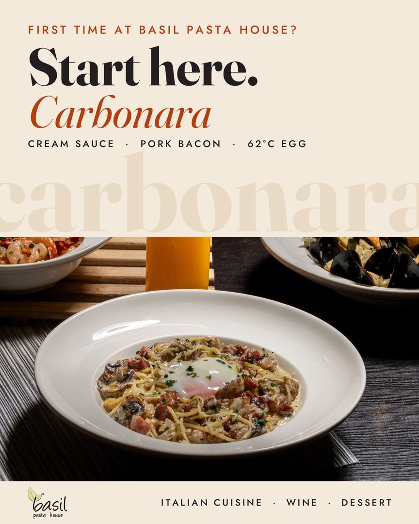
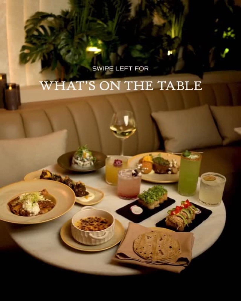
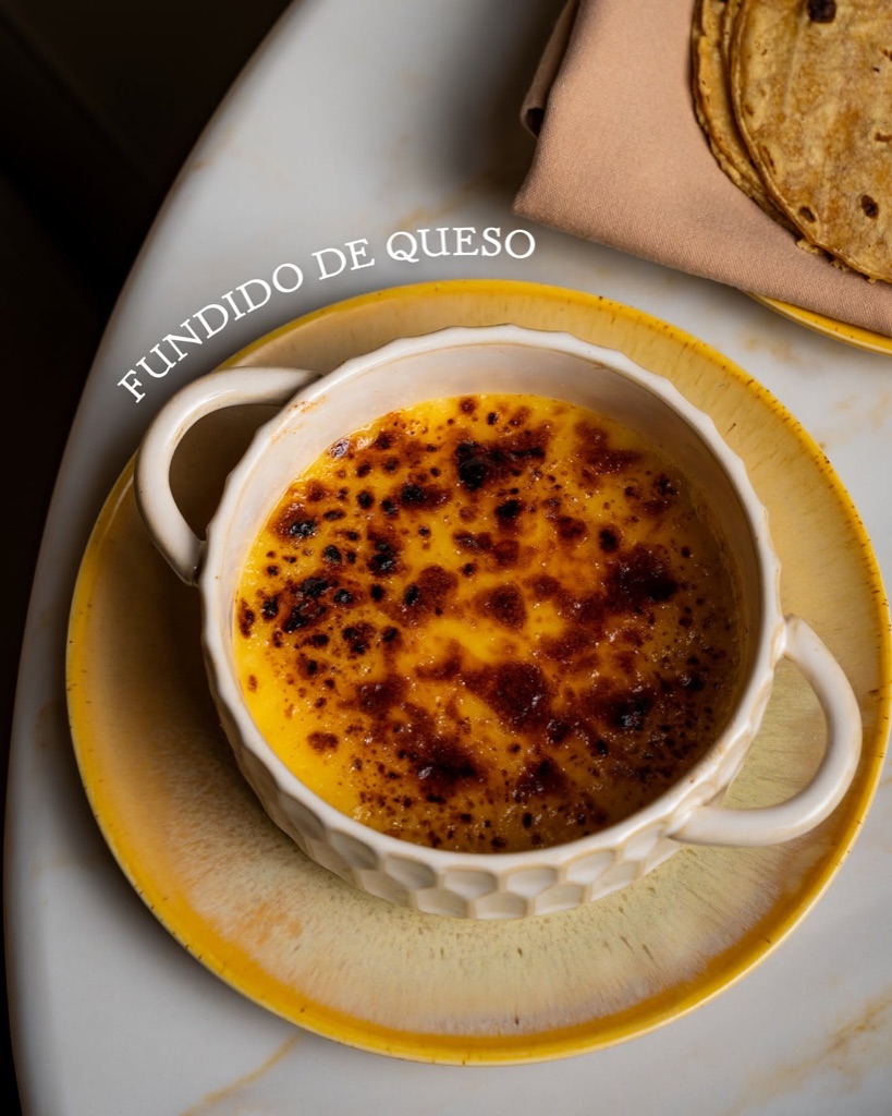
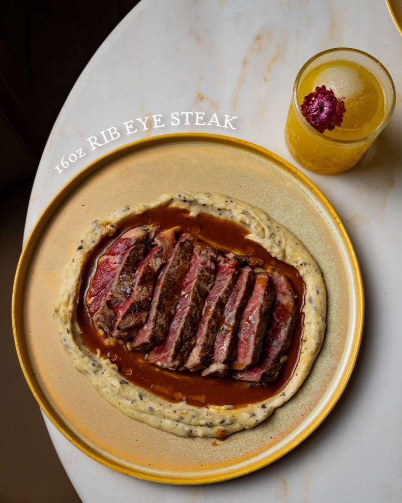
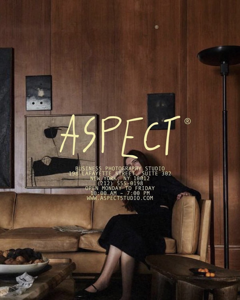
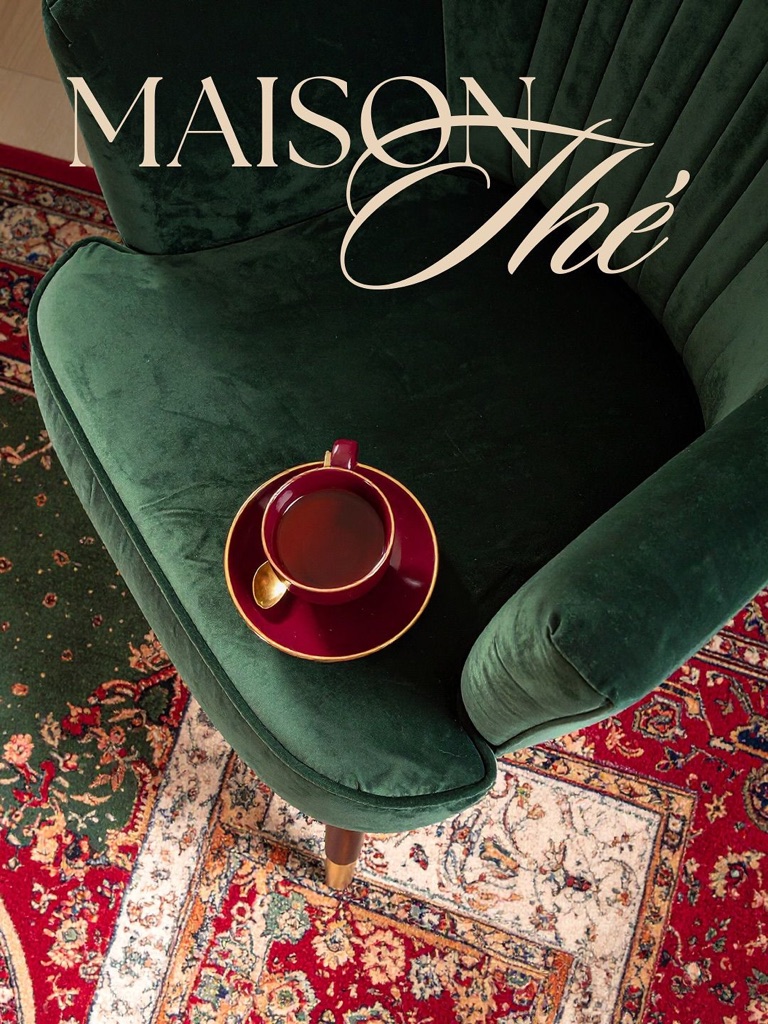
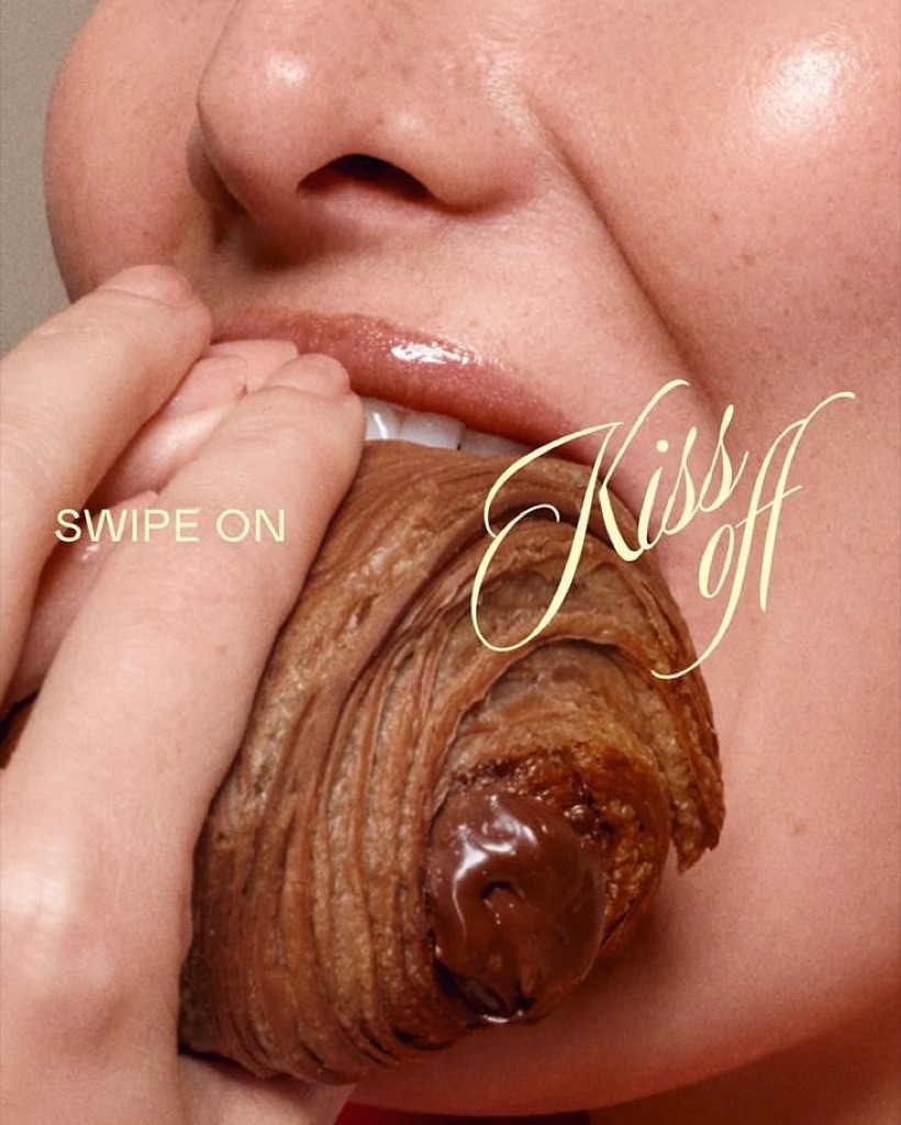
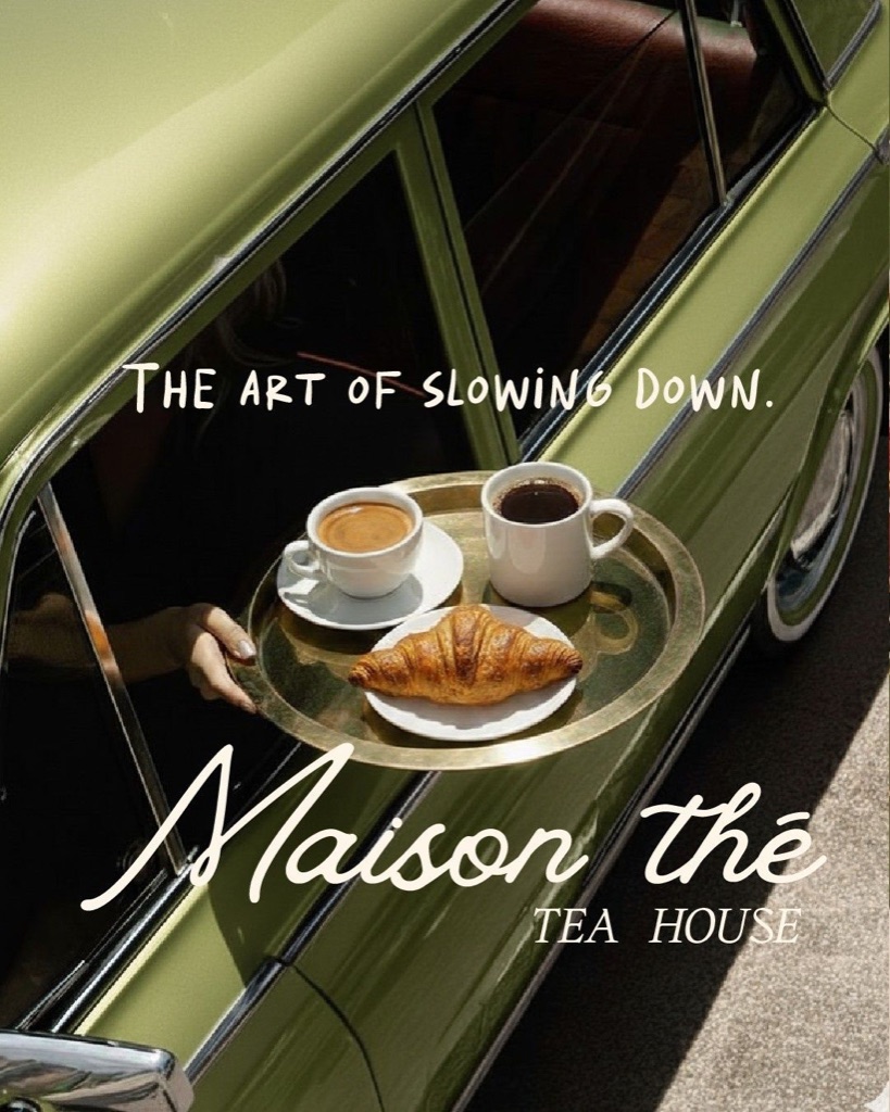
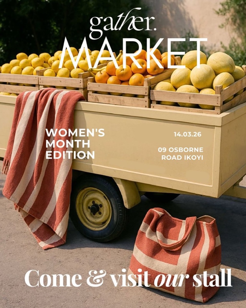
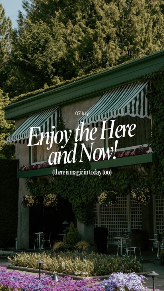
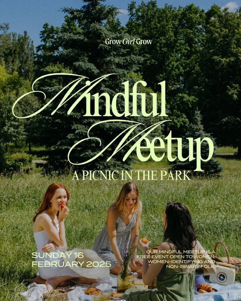
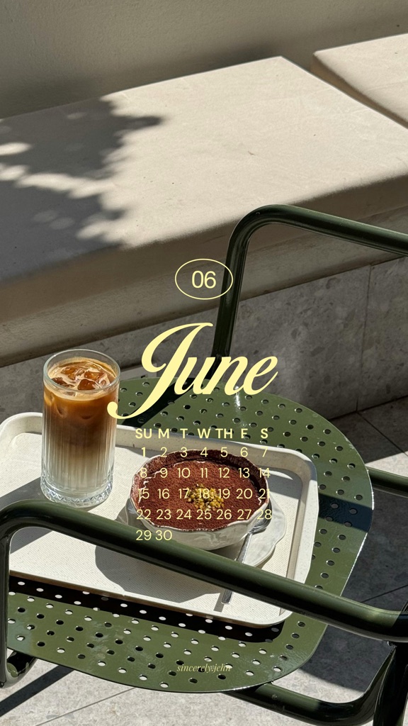
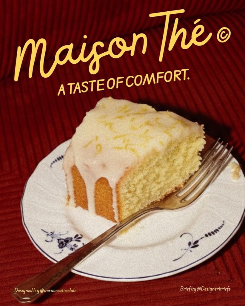
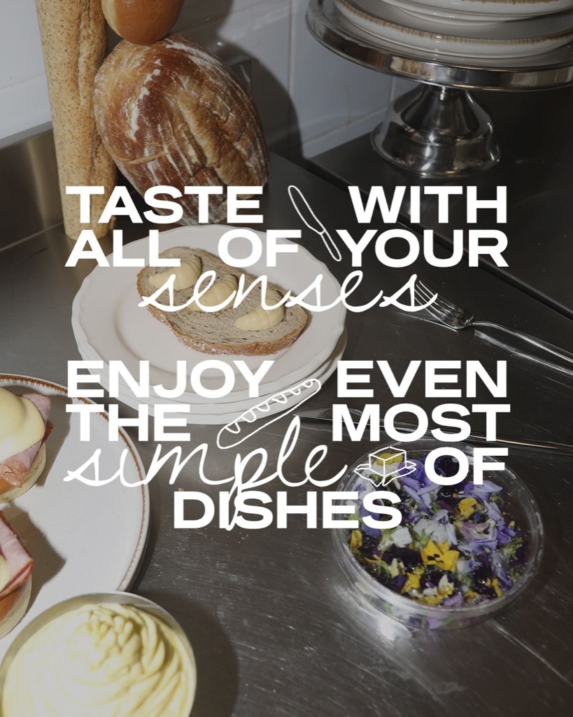
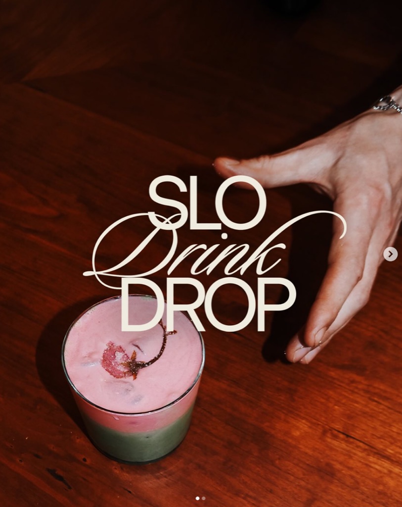
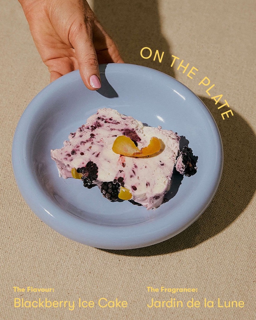
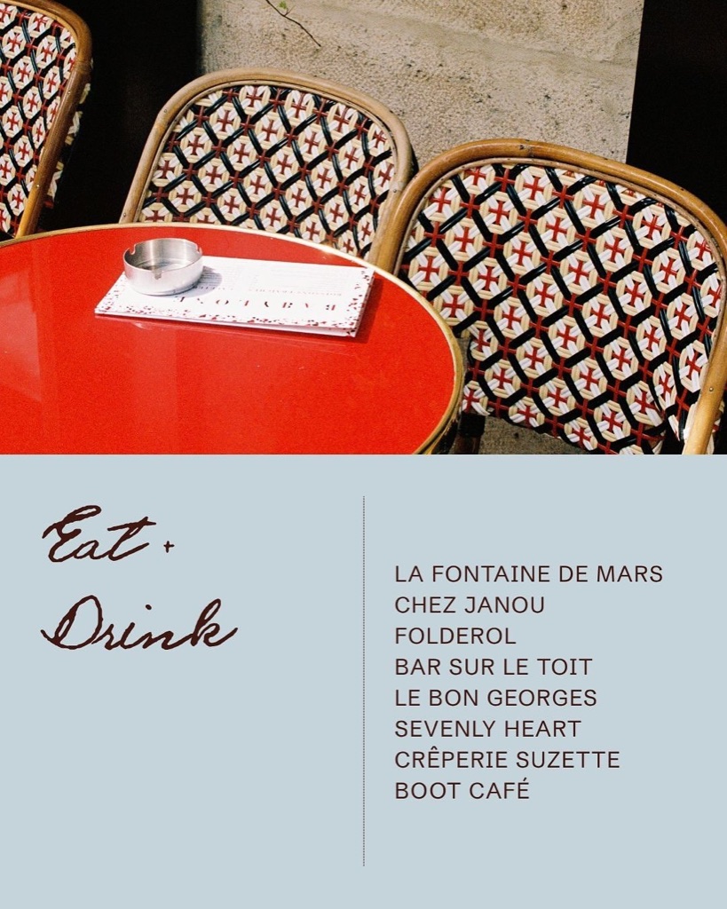
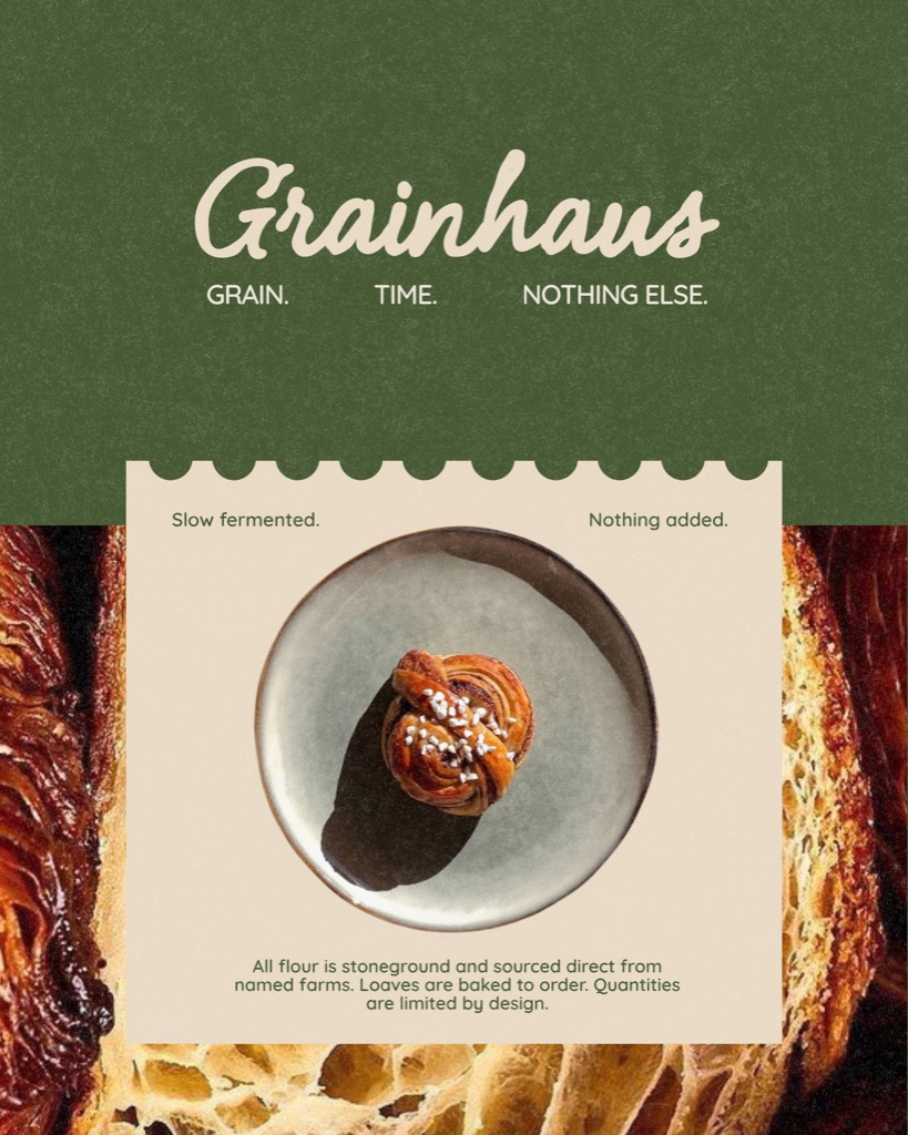
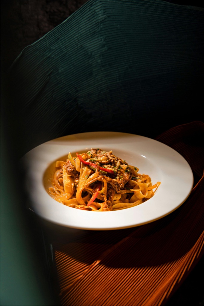
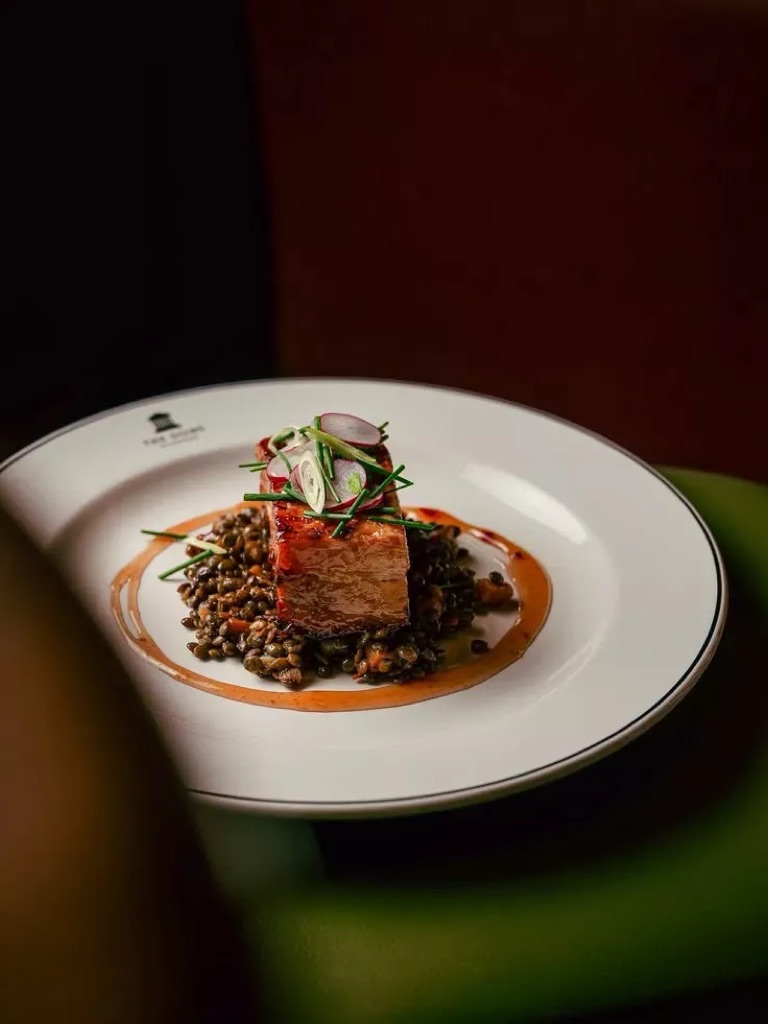
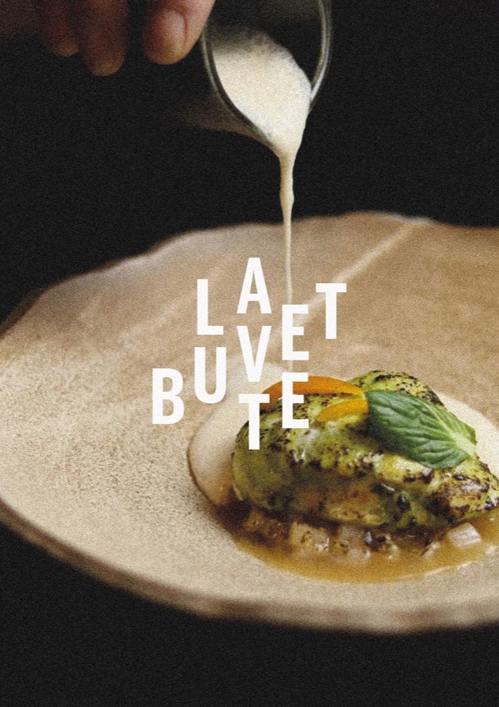
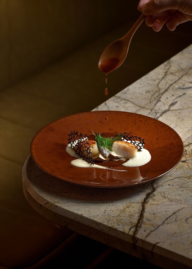
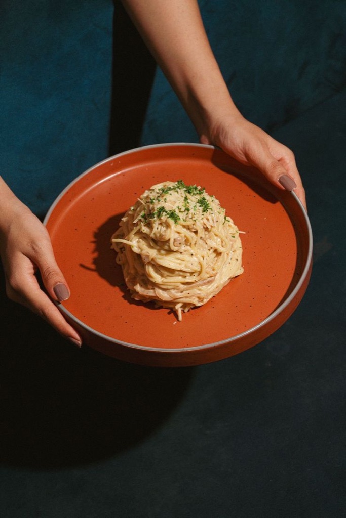
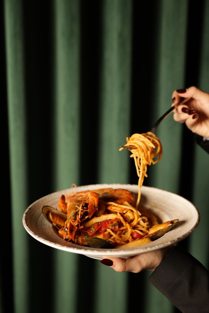
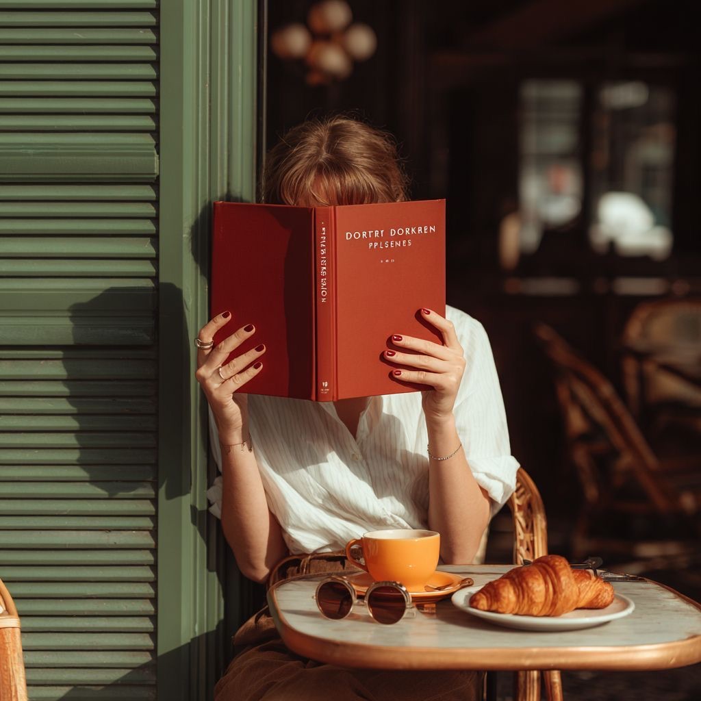
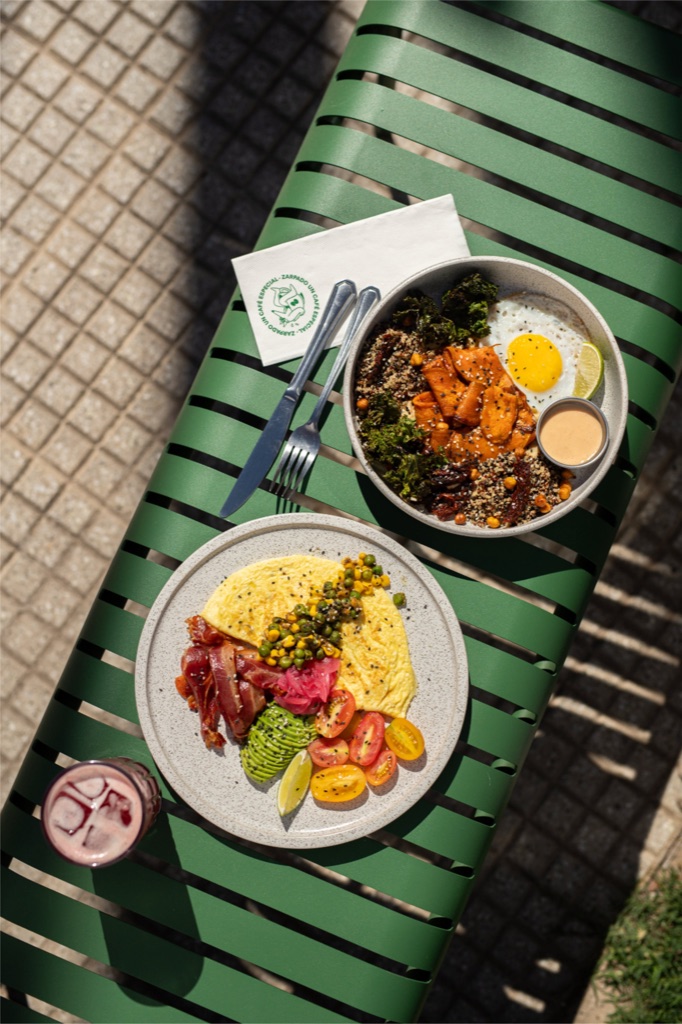
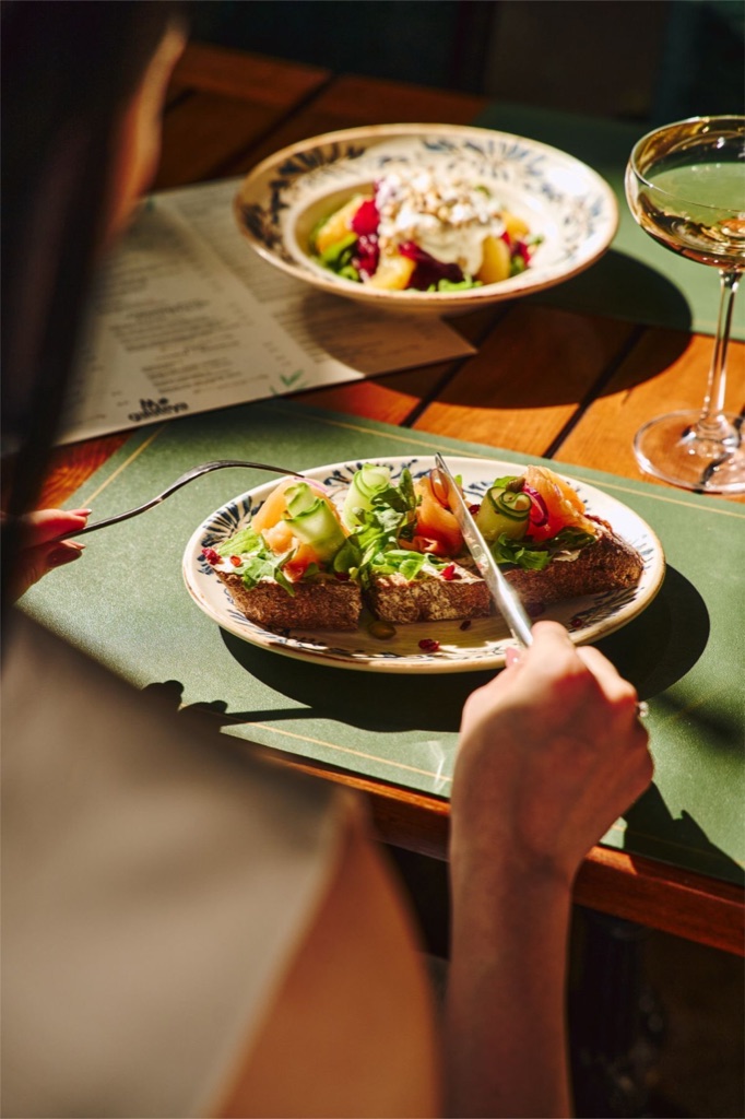
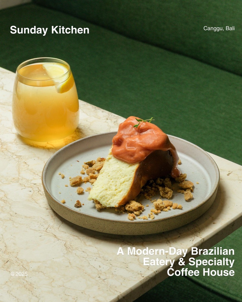
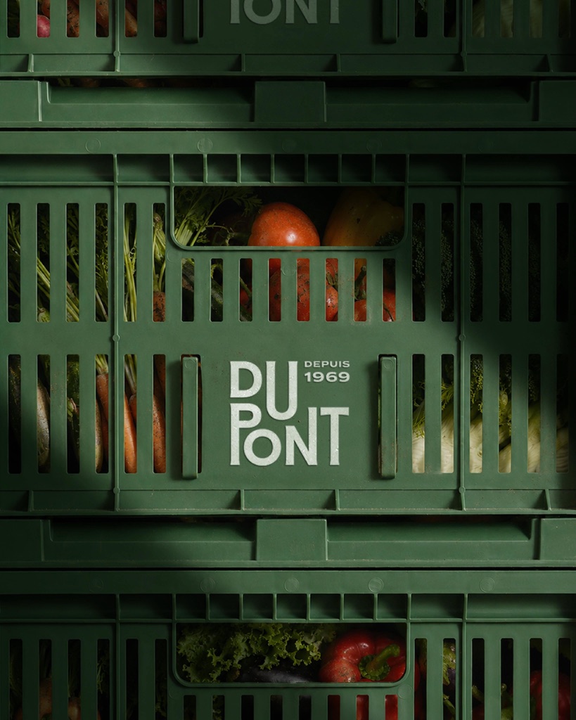
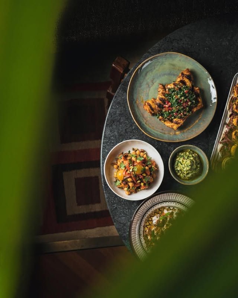
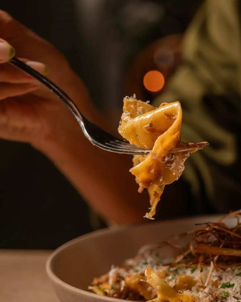
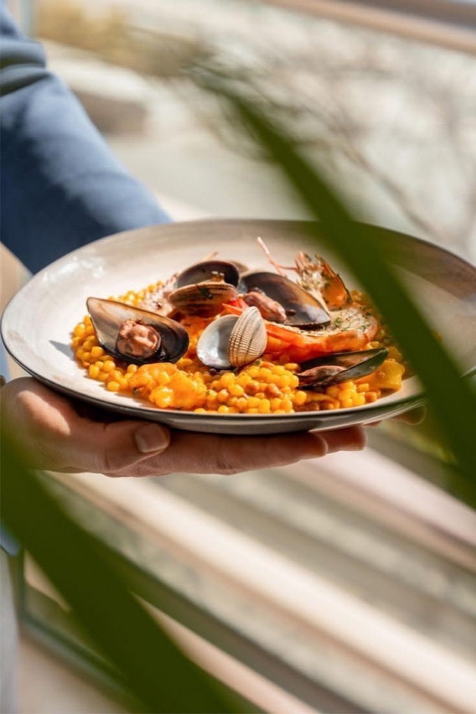
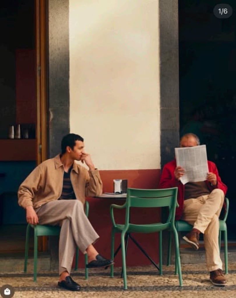
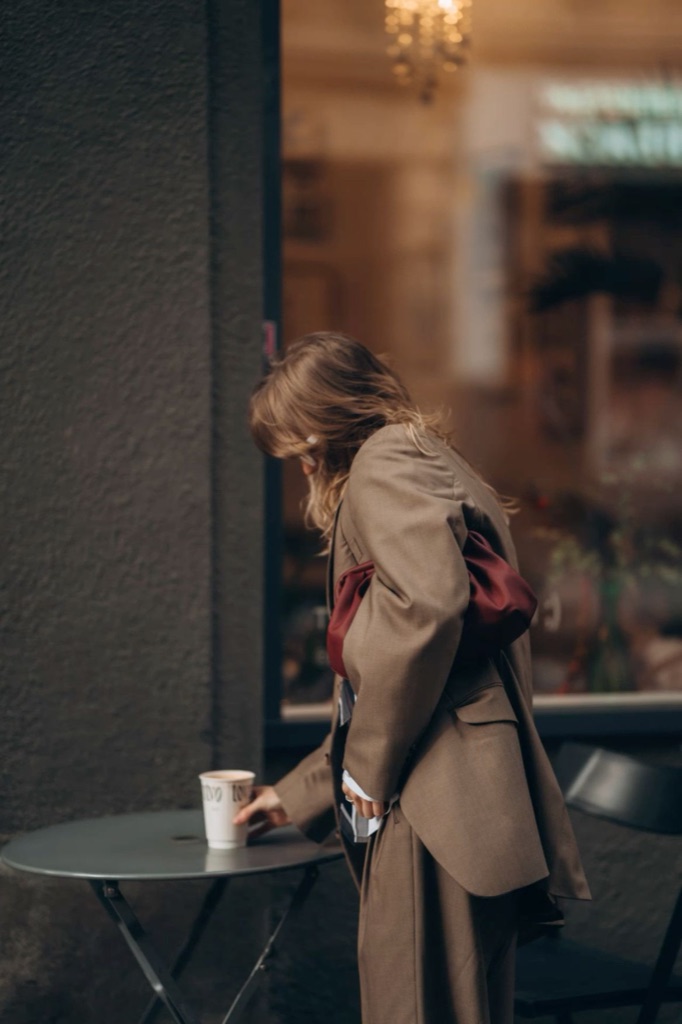
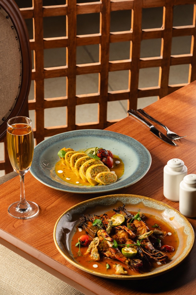
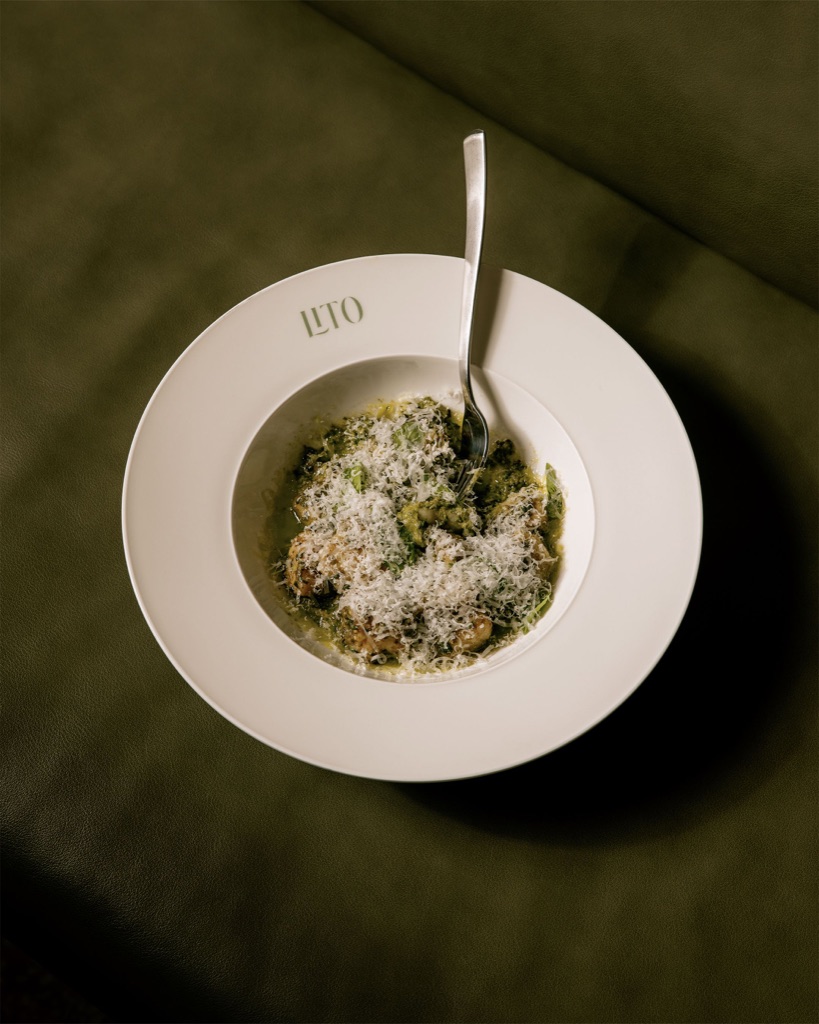
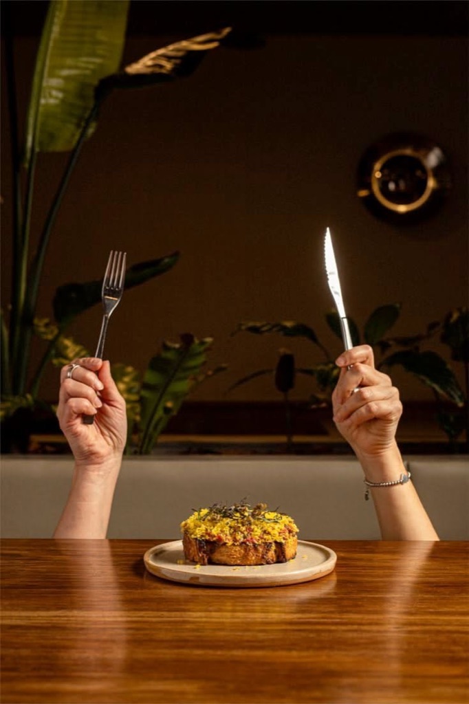
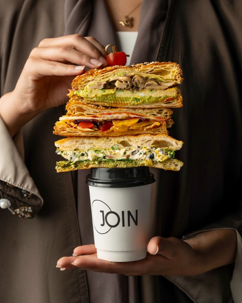
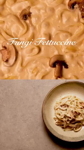
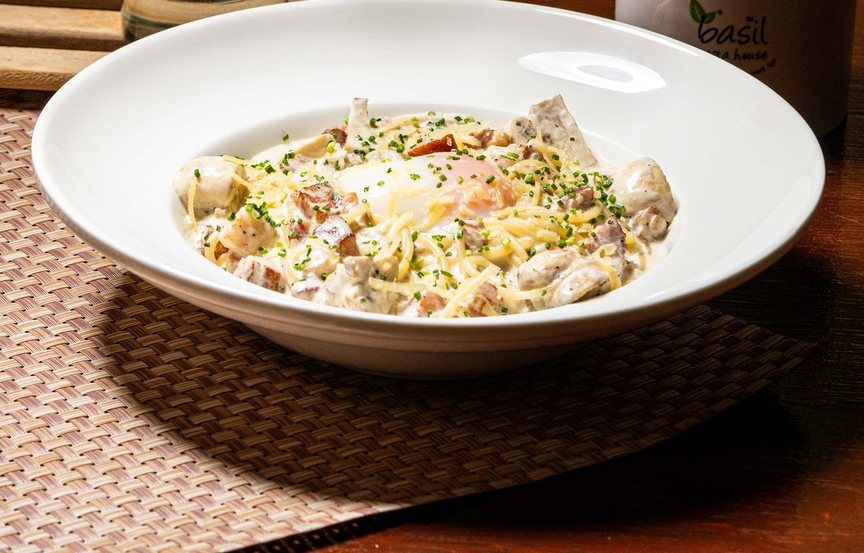
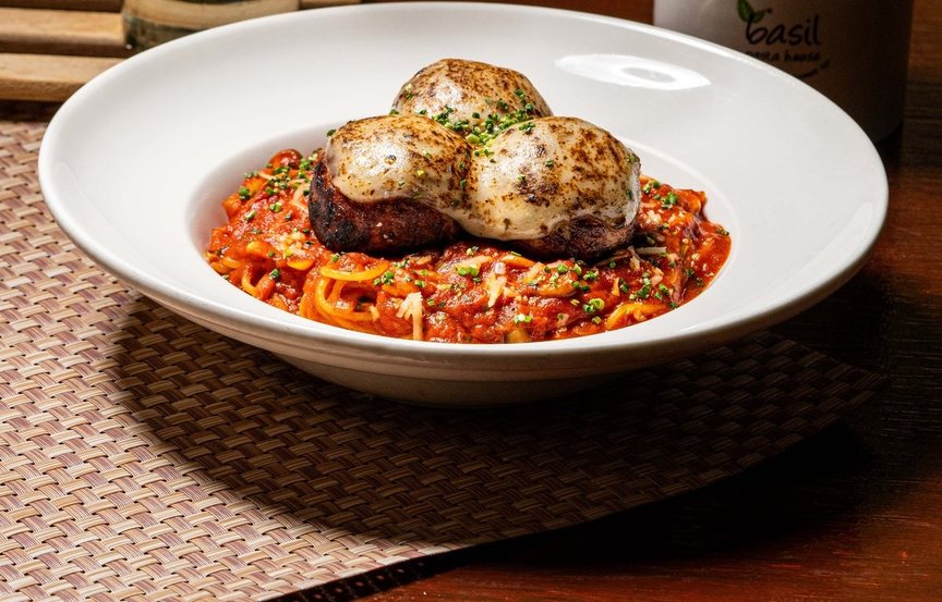
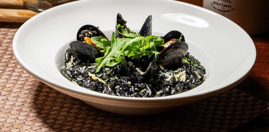
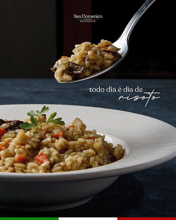
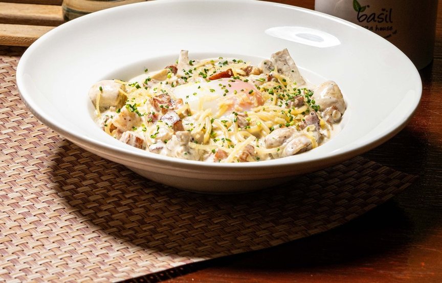
What it looks like: Rich heritage colours (emerald velvet, a Persian rug, a burgundy gold-rim cup, an olive vintage car), close up or from above. A flowing script word laid over serif capitals ("THE ART OF SLOWING DOWN."), overlapping the picture.
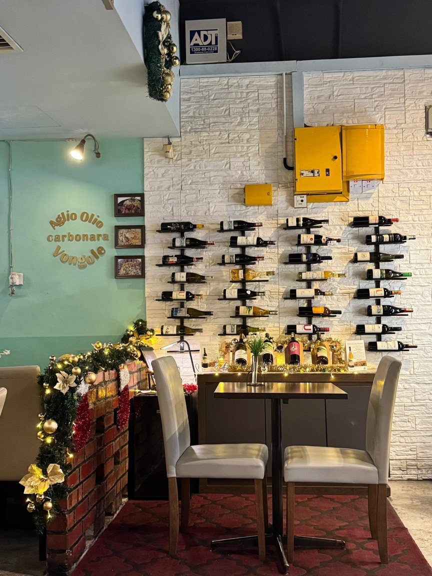
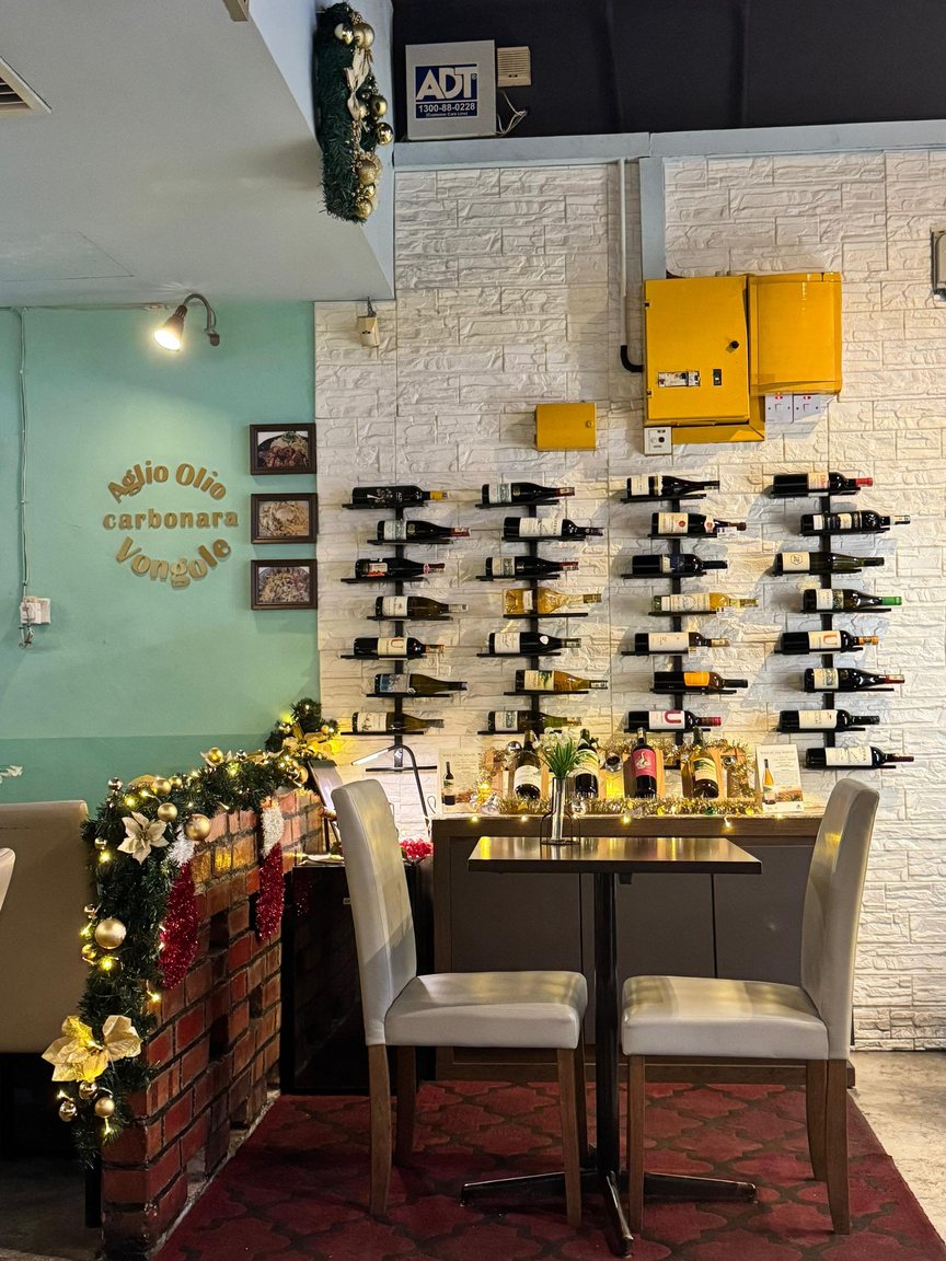
How Basil would use it: Royal green, the wine wall, burgundy grounds. Fraunces Italic plays the script part, large and over the picture, with Fraunces Bold capitals under it and a Jost capitals footer. Words like "slow lunch" or "made with care since 2014".
Best for: The brand story, the wine wall, "stay a while" posts.
Basil's brand rules ban a second handwritten script next to the logo, so this look uses Fraunces Italic instead of a real script. A real script needs Tricia's yes, and never near the logo.